Brands bombard our day-to-day lives. Some become so widely used that they become synonymous with a general class of product. And at the forefront of those brands, the visual stamp that they pay millions to etch into our brains at every given opportunity, are their logos! But how did they come about? And what secrets lurk within?
1 Picasa
Picasa was Google’s photo organizer before it became Google Photos and they turned the logo into a wind fan toy. At first glance the Picasa logo is a colorful camera shutter signifying photos and color. But at the center is a house as Pîcasa considered themselves a “Home for your pics” or Pic-casa.
2. Bacardí
Some find the Bacardi logo cool, others find it spooky. But what has a bat got to do with rum? Apparently in 1862 when the brand first started out producing the world’s first white rum, Facundo Bacardi’s wife was startled by the many fruit bats that were living in the factory’s rafters. Facundo took this as a sign and started putting the easily identifiable logo on the bottles. Today Bacardi is the largest privately held, family-owned spirits company in the world.
3. Orbit
During WWII rationing didn’t just affect families. Confectionery companies also had to improvise with what was available and a handy sweetener at the time was sorbitol. It is thought that Wrigley’s rebranded this new sorbitol sweetened gum as Orbit. Until recently, the two colors making the ‘O’ have been somewhat of a mystery. Until in 2014 Wrigley’s changed the logo revealing a sun shining on the ‘O’ representing the planet half in daylight and half in shadow as the rest of the brand-name orbits around it.
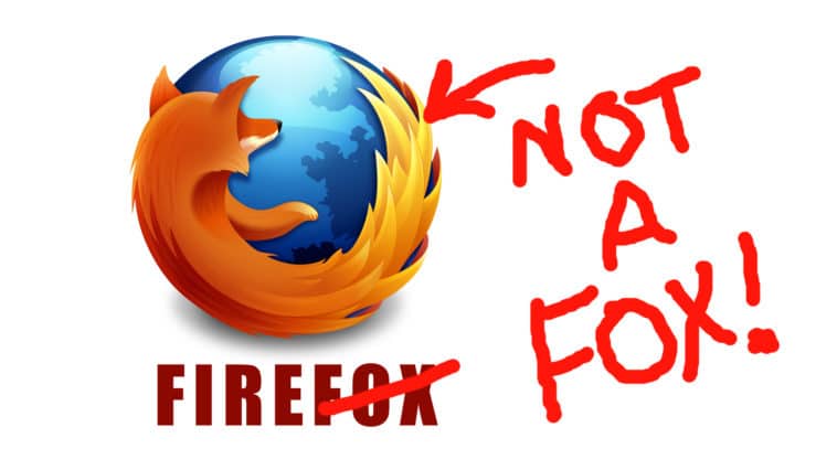
4. Mozilla Firefox
This one’s an easy one right? A fiery fox engulfing the Earth? Er… No. It’s not a fox. Is my whole life a lie?? Firefox started out in the 90’s as Netscape, but struggling to compete against Internet Explorer, which came free with every computer, they wanted something more quirky and it was reborn as “Phoenix” but it quickly became known that Phoenix was already a brand, so Firefox rose from the ashes once again as “Firebird” and maintained the fiery bird logo. Buuuuttttt this was also taken. This time Mozilla went with a Red Panda which in Chinese has the nick-name Firefox. But before you get all excited, no, there isn’t such an animal as a Thunderbird… The panda’s flaming tail is because the designer was inspired by a passage from the bible, about jackals whose tails were on fire.
5. Air BnB
Air BnB is an online marketplace where people advertise lodging in their homes, spare bedrooms and even couches. But what is their squiggly logo all about? No, it’s not a paper airplane. Obviously BNB stands for Bed and Breakfast and Air insinuates you can find lodging anywhere. From thin air. Many think the logo is a weird paperclip or a paper airplane, but it’s actually a person, who loves, to travel.
6. Roxy
Roxy is Quicksilver’s female clothing line. But what’s with the strange logo? On first glance it looks like a pair of hands holding a heart, but it’s actually the ski and surf apparel brand’s logo, duplified!
7. Dell
Back in the 80’s, Michael Dell created his computer corporation in his dorm-room of Austin University. The ingeniously named company “Dell”, okay he didn’t have to put much thought into that one, but the logo has a twisted ‘E’ which comes from the saying “Turn the world on its ear.” Michael wanted to show that Dell puts its own twist on computing much like he has done with own name.
8. Vodafone
To many vodafone’s logo represents an earbud headphone that you might plug in to your device to chat, handsfree. To others it looks like one of Super Mario’s fireballs. But it’s actually much smarter than that. In literature, what does every conversation or dialogue start with? Quotation marks. The single quotation mark represents an open dialogue insinuating that the conversation starts with Vodafone.
9. NewMan
This French clothing company’s logo doesn’t look like it holds much of a secret. Until you do this. The logo reads the exact same way upright and upside down. This doesn’t imply that you can wear the brand’s clothes upright or upside down, but speaks to the company’s innovative and creative way of thinking.
10. National Geographic
Perhaps one of the simplest logos out there, National Geographic didn’t have to think hard about this one. Or did they? National Geographic published its first magazine in the 18 hundreds! The big yellow border on the magazine was designed to stand out and quickly became their logo as they transitioned into the digital era. It represents a doorway or portal through which knowledge is obtained. Even the color is significant, representing the Earth’s natural power-source, the Sun.
Which one of these secrets surprised you the most?
Comment Below and if you liked the video, LIKE IT!