Whether we’re buying a new pair of shoes, or heading for a night out, we’re spending fractions of seconds unconsciously checking out someone’s logo. Hours of thought and art direction meetings go into producing these brand calling cards, so it’s not surprising that many have subtle hidden meanings in them!
1. Google
Probably the most viewed logo in the world. All three primary colors are represented, but then there’s that odd-man-out green ‘l’ right there in the middle. A secondary color… Obviously that’s on purpose, as Google wanted to illustrate their maverick, yet playful approach.
2. Adidas
After marketers decided logos have to actually mean something, a budget conscious executive just tipped the lines slant-wise and came up with some junk about how the slant is a mountain that represents the trials and tribulations that each of us have to overcome. Sometimes they overthink this stuff.
3. London Symphony Orchestra
Not just an attempt to add some modernity to a classical institution. This logo designer is a true artist!
4. IBM
The horizontal lines that spell out the company’s name are also equal signs, meant to represent the technology company’s commitment to equality.
5. Bronx Zoo
If you focus on the negative space between the animals’ legs, you’ll see a rough outline of the Bronx skyline. How did you never see that before?
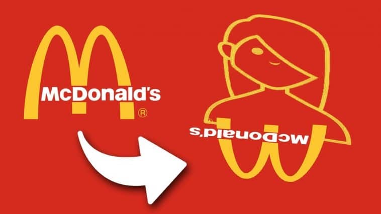
6. McDonalds
This one may not be 100 percent true, but it’s rumored that in the 1960’s, marketers wanted to change McDonald’s logo from its literal ‘M’ to give it more depth, however Louis Cheskin, a psychologist and consultant on the new logo’s design, recommended that they stick with the golden arches because of the symbolism of ‘a pair of nourishing breasts.’ If you say so.
7. Hope for African Children Initiative
Not only does the Hope for African Children Initiative do awesome stuff like build schools, spread AIDS awareness, and feed starving people, but their logo is pretty swell, too.
8. NBC
In the 1950s, when most of the country still had black and white tv sets. the RCA company — one of the top purveyors of color televisions — purchased NBC and wanted some semi-subtle way to show the owners of black-and-white televisions what they were missing out on. So, the multi-colored plumes logo was born.
9. Baskin Robbins
The humps on the ‘B’ and the stem of the ‘R’ actually form a ’31’ an allusion to Baskin Robbins famous 31 flavors. Sure, it’s obvious now that I’ve mentioned it.
10. FedEx
See the arrow hidden between the ‘E’ and the ‘X’? That’s supposed to represent Federal Express’ forward-thinking attitude towards parcel shipment. Contrary to the number of times they’ve misplaced my packages…
Which of these hidden things surprised you the most?
Comment Below!